Vertical Trim and Line Spacing
What line spacing is, a bit of history about how it came about, and how it works in the browser.
Over the past few days, I've been diving into fundamental design concepts: spacing, sizing, colors, typography, and especially design engineering. Line spacing caught my attention early on because it's something I've noticed I usually mess up while I'm training my design skills. I wanted to understand it better and see if I could improve.
What's the problem?
As Sebastian Bailey explains in his article on Vertical spacing & line-height in design systems, creating consistent padding between elements in a design system often begins with setting up proper line spacing and choosing the right typeface, and both tasks truly deserve your time and careful consideration.
While working toward this consistency, I've discovered that line spacing is trickier to understand and apply than it might first appear. It looks like a trivial concept, but it really isn't.
A little bit of history
Back in the day, before the digital age, typesetting was a hands-on craft. Typesetters would arrange metal characters, wooden blocks, and symbols into a composing stick, ink them, and transfer them to paper using a physical press.
To improve readability, they would insert strips of lead between the lines to create additional spacing. They were added below any letter or symbol, and that's how the "leading" term was born for modern typography.
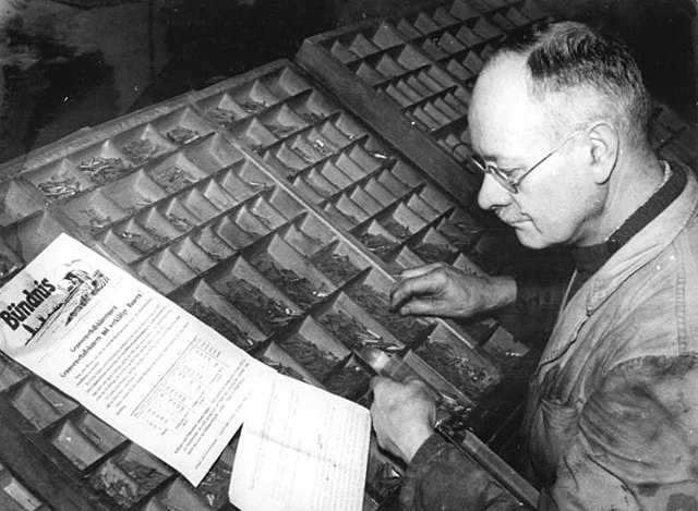
A typesetter at work in 1954. Image credit Wikimedia Commons
In the modern days
Today, typefaces have different line heights because designers enjoy greater freedom in choosing how they want to space their lines. This can create inconsistencies depending on which font you select, especially when multiple fonts are used within the same project.
A common rule that Latin-based typefaces follow is to set every glyph sitting on the baseline.

How different fonts handle line height. The first row shows the default line height, and the second row demonstrates the effect with the Vertical Trim option enabled.
An example of the problem
A common issue I have encountered involves button styling. In this example, we demonstrate a button with identical font, padding (both horizontal and vertical), and text, yet with differing line heights. The first button has the Vertical Trim option enabled, while the second does not. Notice how the button expands differently without vertical trim applied.
You can clearly see that the vertical spacing on the second button is off, with more space at the bottom than at the top.
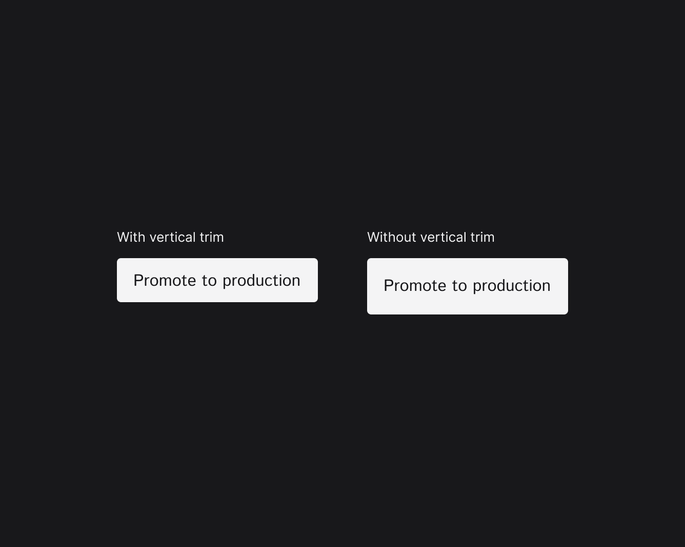
A button with the same font, but with the Vertical Trim option toggled.
Vertical Trim to the rescue
Enabling the Vertical Trim option ensures consistent line height across all text elements: buttons, titles, paragraphs, and more. In Figma, you can activate this feature by navigating to the Text panel and toggling the Vertical Trim option.
 Vertical Trim in Figma.
What about the web?
To fix this for web, we have a property called text-box that allows us to set the line height for a specific text element.
The text-box shorthand property controls the text-box-trim and text-box-edge properties, which together determine how much space is trimmed from the block-start and block-end edges of a text element's block container.
This syntax is defined in the CSS Inline Layout Module Level 3 specification, which is still under development.
.button {
  text-box: trim-both ex alphabetic;
}
There is also an excellent repository by @jantimon that contains helpful examples demonstrating how this property works.
Conclusion
Line spacing is a key typographic principle that enhances readability and creates visual balance in design systems. By using Figma's Vertical Trim feature and CSS's text-box property, you can maintain consistent line heights across all text elements, which helps strengthen design coherence and improves the overall user experience.
It also makes your life easier if you need to change the main font of your design system in the future.
Glossary
typeis the mechanized and consistent reproduction ofletterformsfor a written language.letterformrefers to the unique shape of a letter, with characteristics shared throughout atypeface(or inletteringandcalligraphy).typefaceis the underlying visual design that can exist in many different typesetting technologies.fontis one of the implementations of atypeface, so afontis what you use to display atypeface.glyphis a single representation of acharactercharacteris a single unit of language, like a letter or punctuation mark